My UX/UI experience
My passion for UI/UX design grew alongside my interest in coding. As I began building websites, I naturally started using various UI design tools to wireframe ideas and create visual mockups before moving into development. This process helped me think through structure, usability, and visual hierarchy early on.
Over time, working back and forth between design and code allowed me to develop a strong proficiency in these tools, as well as a deeper understanding of how thoughtful design decisions improve the overall user experience. This combination of design and development continues to shape the way I approach creating intuitive, engaging digital interfaces.
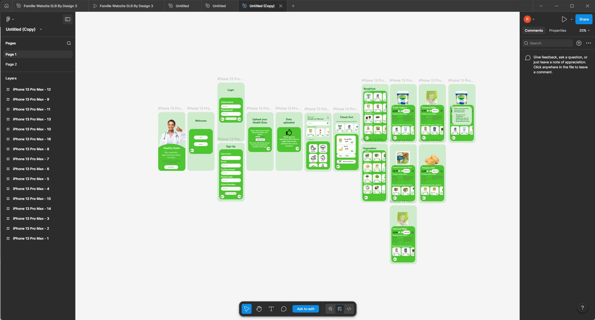
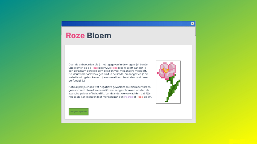
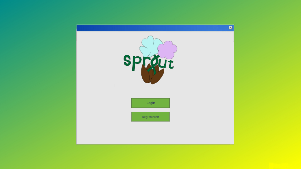
Sprout is an innovative dating app designed to transcend superficial judgments based on appearance. Instead of focusing on looks, Sprout centers around personality compatibility by requiring users to complete a detailed personality trait test. Upon completion, each user is assigned a unique personality type represented by a specific flower.
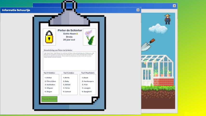
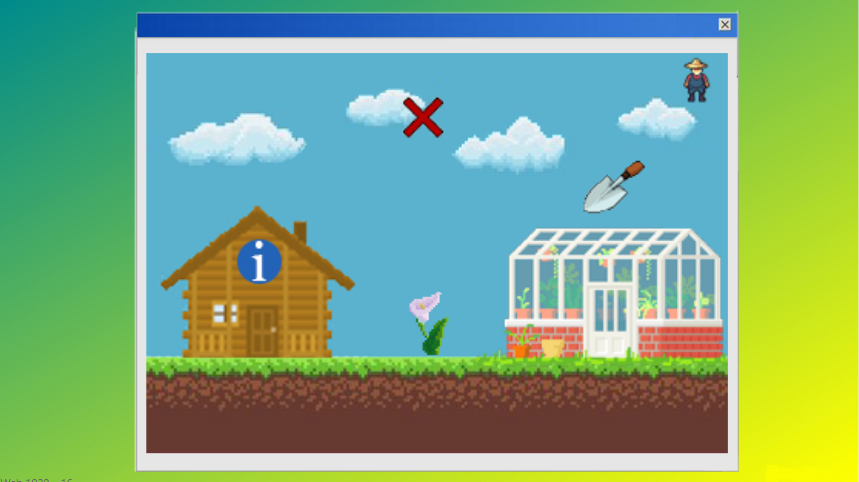
Users are then placed into a digital garden where they encounter only flowers—profiles—that match their personality compatibility. This environment encourages genuine connections, as interactions are based on shared traits rather than physical attraction. Within the garden, users can explore detailed profiles and initiate contact, fostering meaningful and authentic relationships.
This concept exemplifies a thoughtful approach to online dating, prioritizing depth and personal connection.
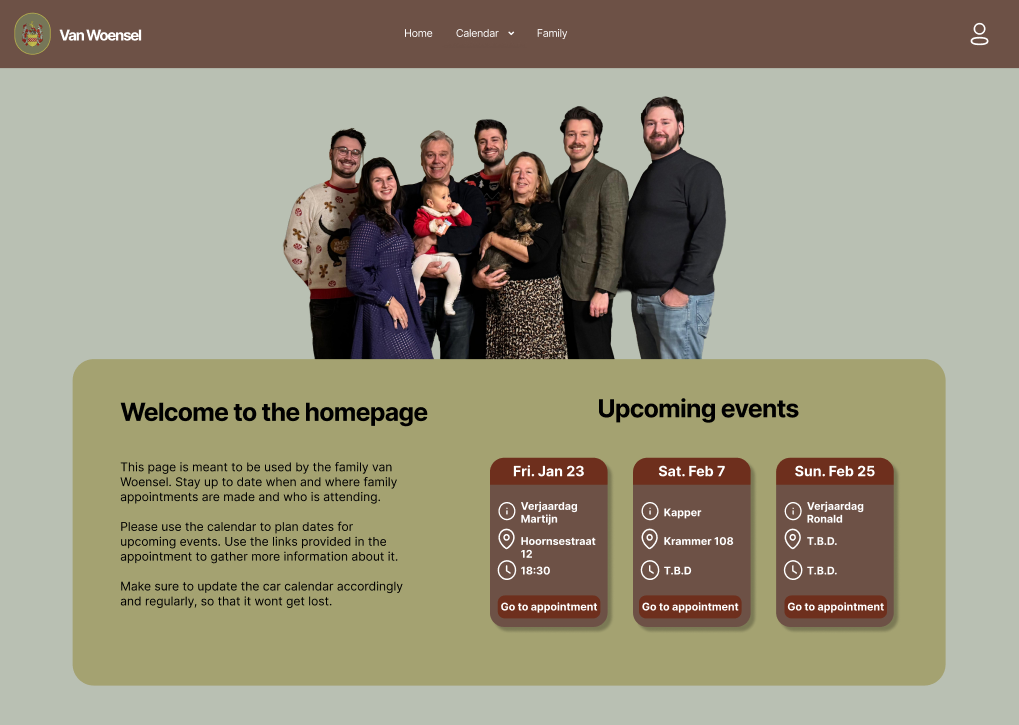
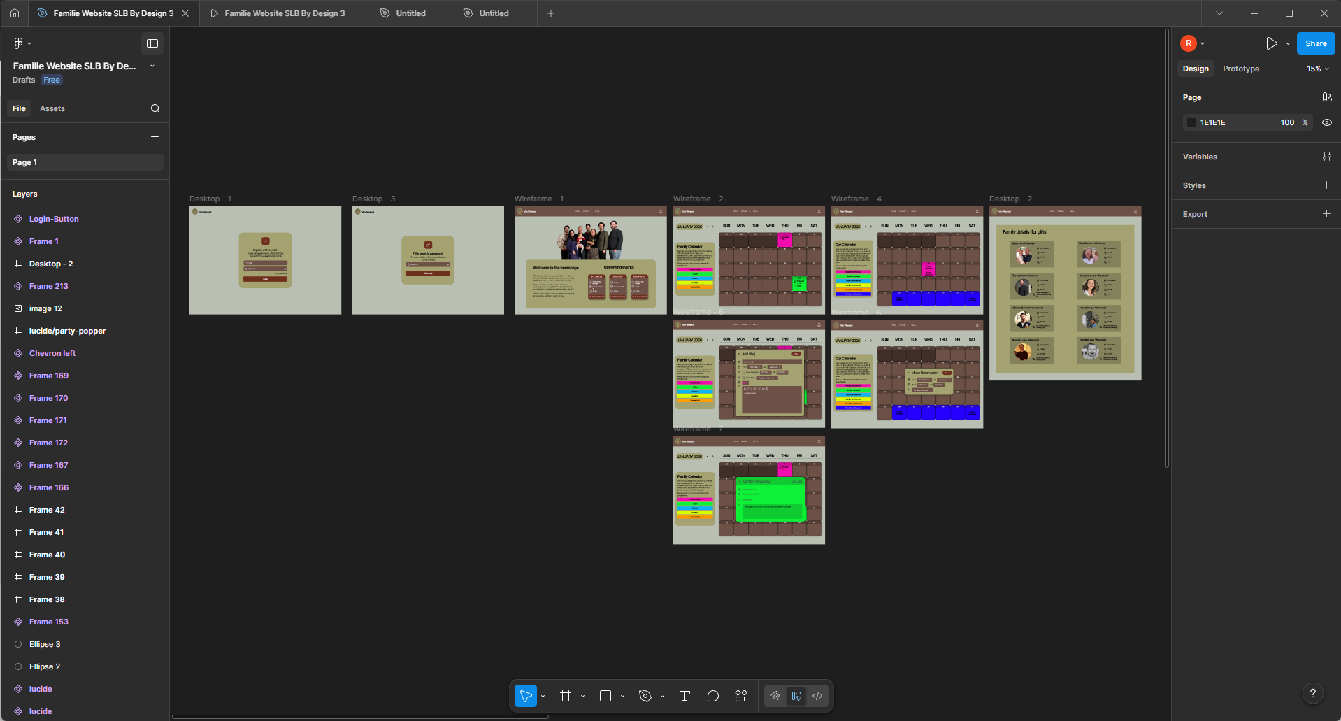
During the process of creating this app, I gained valuable and practical experience in making wireframes and carefully planning web pages with Adobe XD. This essential step allowed me to clearly visualize the layout, structure, and user flow systematically before starting the actual development phase. Subsequently, I meticulously converted the wireframes into a fully functional and interactive website by writing clean HTML code, complemented by well-structured CSS for styling and responsive design. This project not only strengthened my understanding of translating complex design concepts into clean, efficient, and responsive web pages but also significantly improved my skills in both modern design tools and front-end coding techniques.
Adobe XD
Figma
As Adobe XD gradually became less aligned with my needs and current design workflows, I made a conscious decision to transition to Figma. Staying adaptable and up to date with industry-standard tools is important to me, especially in a field that evolves as quickly as UI/UX design.
Because of my prior experience with Adobe XD, many of the core design principles and workflows translated naturally into Figma. This allowed me to get started relatively quickly and focus on expanding my skills within the platform, such as working with components, auto-layout, and collaborative design features.
Below are several examples of my work that reflect my design process, attention to detail, and growing proficiency with Figma.